Prepare A Report on Basis of Data Analysis Of The Underlying Causes Of Death In Queensland
- Country :
Australia
1.0 Introduction
1.1 Authorization and Purpose
This report has been prepared to deliver the findings from analysis of data produced by the Queensland government pertaining to the causes underlying deaths in the state of Queensland between the years of 1997 and 2017, inclusive, and the work undertaken in its preparation and analysis.
No specific goal has been stated for the analysis. This report is intended for researchers, representatives of business or government agencies with interest in the subject of this data.
1.2 Limitations
Due to this data being published with no consideration of it being imported into an analysis package such as R, some visual observations of the data are required to ascertain which data within the file is of sufficient quality and consistency for analyzing, and then values or subsets of insufficient quality will be excluded through necessity.
This report is not intended as comprehensive and will focus on a few causes contained within one set of data at most. A limiting factor within the data supplied is the absence of other data, such as the yearly population of the state, which would reveal whether population change correlates with observed changes within the dataset under scrutiny, for example.
1.3 Scope
For this analysis, a dataset of recorded values showing the causes underlying the deaths of Queenslanders and their frequency per year which was published in 2017 by the Australian Bureau of Statistics has been selected.
The health development of Queensland from 1997 until 2017 shown within the data will be used for analysis and consideration will be given to the findings. The data will first undergo pre-processing and the constructed data tables loaded into R for statistical analysis in both univariate and bivariate sets. Appropriate graphs will be produced with R programming, and the code used will be shown. Advanced analysis will follow in the form of an explanation of clustering and k-means before cluster analysis of prepared data to group years according to a cause. Further advanced analysis will then be performed through linear regression following a brief explanation of the concept.
After conclusions have been drawn, the findings will be reflected upon.
2.0 Data Setup
The file underlying-cause-death-qld.csv is loaded into Microsoft Excel, and preliminary ideas for analysis are formed.
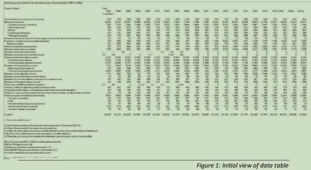
An initial look at the data as supplied shows it to be in a state that would be difficult to load into R (see figure 1), as it contains many comments and a variety of blank or non-useful cells, so a clean-up of underlying-cause-death-qld.csv will have to occur manually, with Excel. Note is made of the numerical values formatted to have a thousands column separator of a comma, which would force R to consider the values as text, rather than numbers.
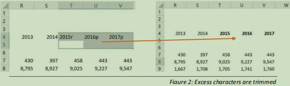
In the file, there are some explanatory notes following some of the values in the Year headings. These are removed (see figure 2).
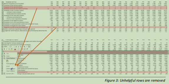
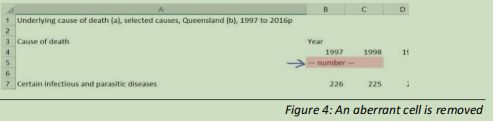
Rows 19, 20 and 31 in the table contain erratic or unhelpful data (see figure 3), and so are removed along with a value in a cell that is floating amongst the data and will not assist analysis (figure 4).
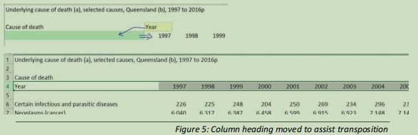
Within the structure of the data file, some cell contents require editing to improve the layout for our needs (figure 5)
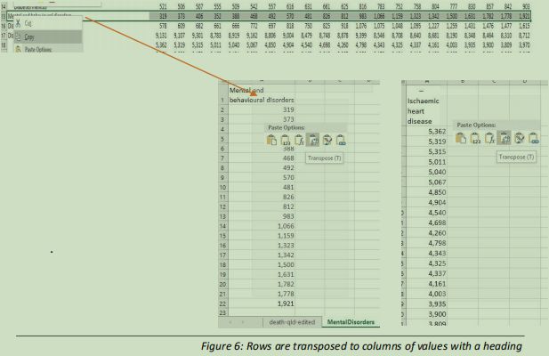
A set of values of interest is chosen and transposed into a column with a header on a unique worksheet, as shown in figure 6.
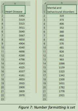
This is followed by a second set, as two univariate analyses will be performed. These columns of values have unnecessary commas in the values, so the number format is changed to number with no commas and no places after the decimal, as all the values given are integers (see figure 7)
The 21 observations listed for heart disease deaths, and deaths attributed to mental and behavioural disorders are chosen for univariate analysis.
Initial observation suggests a near linear change in the valuesIn section 3.2, exploratory bivariate analysis will be conducted, and so datasets are prepared for this purpose.
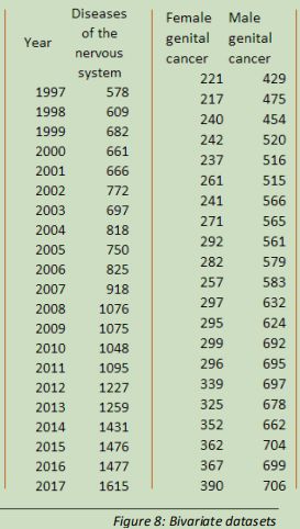
The first dataset created has the ordinal categorical values of each year in the record, listed with the discrete quantitative values for deaths related to diseases affecting the nervous system in each of those years.
The second two-variable dataset contains the observations for cancers of the reproductive organs, with the variables of female and male.
All of these separated lists are exported from Excel as comma-separated value files.
Also exported are the bivariate yearly data showing deaths caused by influenza for use in cluster analysis in section 4.1 and a bivariate set for linear regression analysis in section 4.2
In R, the directory to where the .csv files have been exported to is set to be the working directory, containing all project data files for analysis by R.
3.0 Exploratory Data Analysis
3.1 Univariate Analyses
3.1.1 Univariate Analysis 1: Mental and Behavioural Disorders
Now that the data has been made more tidy, exploratory data analysis can begin in order to both get information from and gain some intuitive sense of the data (Pathak 2014).
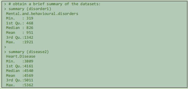
In order to check the success of loading and see that the values are correctly represented, the R command head() is used.This gives an idea of the range of the data.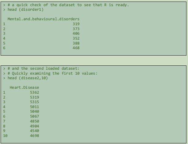
 The previously observed potential for linear relationship recommends a barplot of the disorder1 data to confirm this idea.
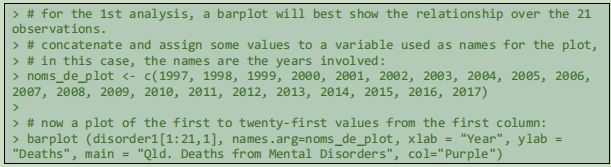
Adding some titling and axis labels makes the plotted graph more informative, and so the names (years) observed during the initial views of this data are added to the graph:
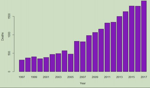
Each bar across the horizontal (X) axis represents one of the sampled years, with the recorded number of deaths on the vertical (Y) axis so the height of each bar shows the value for that year. With the values plotted against each other and scaled relative to the range of zero to the maximum in the vector, a relationship can be seen among the values. This bar graph reveals an almost linear increase in deaths due to mental disorders in the 21 years of data, with an increase from the previous value for most years. As given in the summary, the number has jumped from 319 in 1997 to 1,921 in 2017, which is an increase of 602%.
> # Calculate a percentage change between the final and first values:
> 1921 / 319
[1] 6.021944
3.1.2 Univariate Analysis 2: Heart Disease
The second univariate analysis is of the data for deaths caused by Ischaemic heart disease.
> # a boxplot of the second set, to show the median and quartiles:
> boxplot.default(disease2[,1],ylab = "Deaths", main = "# of Qld. Deaths from
Ischaemic Heart Failures 1997 - 2017", col="Dark Red")
3.0 Exploratory Data Analysis
3.1 Univariate Analyses
3.1.1 Univariate Analysis 1: Mental and Behavioural Disorders
Now that the data has been made more tidy, exploratory data analysis can begin in order to both get information from and gain some intuitive sense of the data (Pathak 2014).
In order to check the success of loading and see that the values are correctly represented, the R command head() is used.
A brief summary of the datasets is obtained with the R command summary(). This gives an idea of the range of the data. The previously observed potential for linear relationship recommends a barplot of the disorder1 data to confirm this idea.
Adding some titling and axis labels makes the plotted graph more informative, and so the names (years) observed during the initial views of this data are added to the graph:
Each bar across the horizontal (X) axis represents one of the sampled years, with the recorded number of deaths on the vertical (Y) axis so the height of each bar shows the value for that year. With the values plotted against each other and scaled relative to the range of zero to the maximum in the vector, a relationship can be seen among the values. This bar graph reveals an almost linear increase in deaths due to mental disorders in the 21 years of data, with an increase from the previous value for most years. As given in the summary, the number has jumped from 319 in 1997 to 1,921 in 2017, which is an increase of 602%.
> # Calculate a percentage change between the final and first values:
> 1921 / 319
[1] 6.021944
3.1.2 Univariate Analysis 2: Heart Disease
The second univariate analysis is of the data for deaths caused by Ischaemic heart disease.
> # a boxplot of the second set, to show the median and quartiles:
> boxplot.default(disease2[,1],ylab = "Deaths", main = "# of Qld. Deaths from
Ischaemic Heart Failures 1997 - 2017", col="Dark Red")
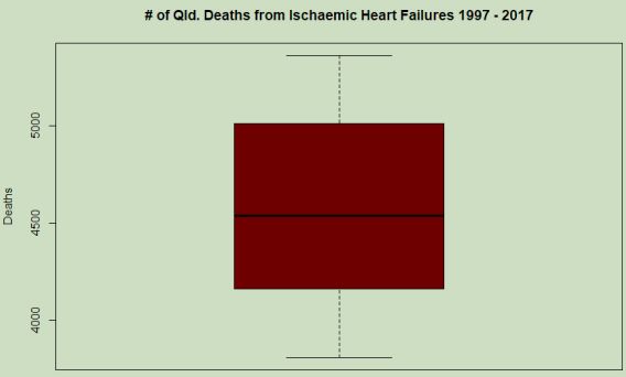
In this boxplot (figure 10), the range of values in the vector are shown from a maximum approaching 5400 deaths and a minimum appearing near 3800, and the median displayed at just over 4500, agreeing with the previous summary. The median is the 50th percentile, at which the range has half of the values greater and half lesser. Within the boxed area are the 50th-75th percentile values are represented above the median and the 25th-50th below the line. Outside the boxed area are the lower 1st-25th percentile (1st quartile) and 75th-100th percentile (4th quartile) above the box, ending at the whiskers. A single variable boxplot such as this shows some properties of the data, however when displaying this vector in this way, it does not lend much to discussion as there is nothing correlated to the range of numbers. From this plot however, an idea of the distribution of the values within the vector can be found and so it is a useful tool for awareness at this initial exploratory stage of the analysis.
The change over the time of observation can once again be calculated by R:
> # Calculate a percentage change between the first and final values:
> disease2[21,]/disease2[1,]
[1] 0.7403954
A reduction to 74% of the initial amount is revealed.
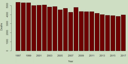
In order to gain a contrast for further discussion, it is a simple matter to use Rs command history to recall the settings for the first barplot and edit to represent the second dataset:
# more revealing as an "apples to apples" comparison:
barplot (disease2[1:21,1], names.arg=noms_de_plot, xlab = "Year", ylab = "Deaths", main = "Qld. Deaths from Heart Disease", col="Dark Red")
declined in the studied period. Applying the consideration of increasing population to this result shows that this cause of death has generally diminished in the state of Queensland.
With this knowledge, a second viewing of the boxplot shows by how much the frequency has declined, and roughly how many deaths from this underlying cause can be expected in a given year (not a great thing to expect).
3.2 Bivariate Analyses
3.2.1 Bivariate Analysis 1: Years and Diseases of the Nervous System
In this section the relation between datasets having two variables will be analysed and plotted. R has a scatterplot function and this is entirely appropriate to observe these relationships.
Following a similar initial sequence as the previous section, the prepared bivariate datasets are loaded into R and assigned to variables with appropriate names.
> # Load the bivariate Nervous System data:
> bivar_YearNerv <- read.csv ("Year-Nervous.csv", header = TRUE)
Since the relationship between years as categories is already genrally understood, R is queried for a summary() of the discrete quantities in the second column.
> # Get a summary of Nervous disorder data to examine and verify the loading:
> summary(bivar_YearNerv[,2])
Min. 1st Qu. Median Mean 3rd Qu. Max.
578.0 697.0 918.0 988.3 1227.0 1615.0
The initial summary also displays a significant range and suggests an increase or decrease over time. The scatterplot will reveal the presence or absence of any trend in the data.
> # Assign a title to a variable then generate a scatterplot for bivar_YearNerv:
> toptitle <- "Deaths caused by Nerve Diseases"
> plot(bivar_YearNerv, main = toptitle, ylab = "Deaths", type = "o")
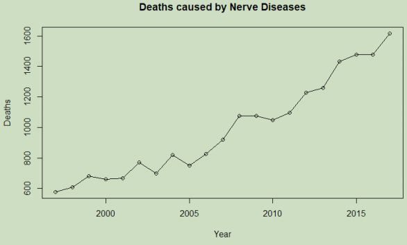
The generated scatterplot suggests a correlation between the increase of years and deaths caused by diseases of the nervous system. What the reason for this may be is beyond the scope of this report and some years have shown a reduction from the previous values, however the trend of increasing frequency is clearly indicated.
The size of the data frame bivar_YearNerv can be found with R command dim()
> # Find the number of rows and columns in bivar_YearNerv:
> dim(bivar_YearNerv)
This shows 21 rows and 2 columns. The first column is the year, and the variable whose change is of interest is the second column of values, deaths from "Diseases of the nervous system".
> # Calculate the percentage change between the 1st & the last value for Deaths:
> bivar_YearNerv[21,2] / bivar_YearNerv[1,2]
The number of deaths per year has increased by 279% over the twenty-one years of data.
3.2.2 Bivariate Analysis 2: Female and Male Genital Cancers
The fourth prepared dataset is now loaded into R for analysis.
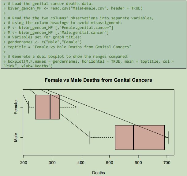
The differences between the gender variables are revealed by a dual boxplot, a version of the boxplot that demonstrates here that it has relevant application to analysis of multivariate datasets. Once more, when datasets are presented in the same form, differences become apparent, and information is revealed.
From this plot, the minimum number of male deaths attributed to genital cancers has, for every reported year, been higher than the maximum number of female deaths resulting from this cause, with no outlying years.
4. Advanced Analysis
4.1 Clustering
4.1.1 Brief Explanation of Cluster Analysis and K-Means
In the preceding analysis sections, data has been deliberately segmented and placed into categories in order to find similarities, differences, patterns or correlations. This has all been what Provost and Fawcett (2013) denote as supervised modelling, but now in this section instead the focus is on unsupervised modelling, specifically cluster analysis, to find tendencies for discrete variables to form clusters when charted (Akerkar & Sajja 2016). Cluster analysis methods seek to discover structure in data that occurs through regularities of a dataset rather than a specific variable being the focus (Provost & Fawcett 2013). Particular features of data objects are used to divide those objects into clusters according to intrinsic similarities between the objects (Akerkar & Sajja 2016), rather than labelling by category (Jain 2009).
Jain (2009) identifies K-means to be one of the most popular clustering algorithms. K-means clustering identifies where to partition data so that the mean of points in the cluster and the points themselves have the minimum squared error (Jain 2009). The cluster has a centroid represented by the mean of each cluster members dimensions (Provost & Fawcett 2013) and the number of clusters desired is denoted by K, where for example K=4 means 4 centroids and therefore 4 clusters (Provost & Fawcett 2013). The K-means algorithm works in multiple passes upon the data and after initial partitioning it recalculates the centroids in order to reduce the sum of squared error between the cluster members and centroids, iterating until the clusters remain unchanged (Jain 2009; Provost & Fawcett 2013).
4.1.2 Clustering Analysis: Grouping Years According to Influenza Deaths
> # Clustering analysis data is loaded:
> YearFlu <- read.csv("FluCluster.csv", header = TRUE)
Next, the number of clusters must be decided. With a larger dataset, ideally this could be calculated in R for optimisation, however with only 21 values for each variable making up a relatively small dataset in this era of big data, it is desirable to avoid overfitting (Provost & Fawcett 2013) and so seven is chosen to be the centers value for K in this analysis.
> # Give 8 attempts to find best 7 clusters with lowest SSE:
> KMFlu <- kmeans(YearFlu, 7, iter.max = 5, nstart = 8)
> # Check whether max iterations was reached:
> KMFlu$iter
The algorithm allocated the centroids with only 2 iterations, and so the best possible fit has been made for seven clusters.
> # Plot the resulting cluster analysis for observation:
> clusplot(YearFlu, clus = KMFlu$cluster, color = TRUE, shade = FALSE, lines =
0, main = "k-Means Clusters of Influenza Deaths in Qld.", ylab = "Years", xlab =
"Deaths", labels = 3)
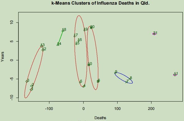
The plotted clusters display that extremely high fatalities caused by influenza are seen for a period of only one year, with three consecutive years of high fatalities being shown clustering apart from what appears to be groups of typical case frequency.
4.2 Linear Regression
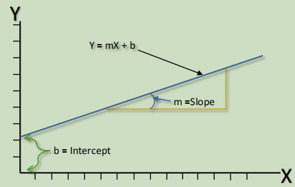
4.2.1 Brief Explanation of Linear Regression
A form of supervised modelling, regression algorithms are used to develop models from independent input variables which can be qualitative (ordinal or nominal) or quantitative (continuous or discrete), and output a dependent continuous numeric variable used to predict a real value (Akerkar & Sajja 2016; Pathak 2014). Linear regression assumes that the independent and dependent variables have a linear relationship (Pathak 2014). When given the predictor input variables, linear regression comprises the learning of a function using the least squares method to predict a value for a target output variable (Pathak 2014).
Simple linear regression has only one dependent target variable and one independent predictor value (Seber & Lee 2003), and so seeks to determine given through the fitting of a line to the graph.
The two coefficients of the regression model are the slope of the line showing the relationship, and the intercept (Akerkar & Sajja 2016), which is the value where the lowest value for intercepts the axis (see figure 15).
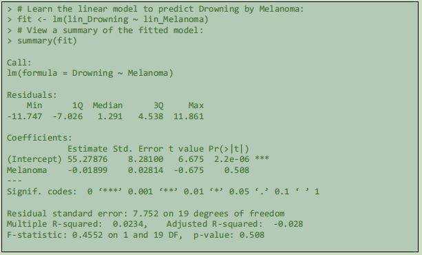
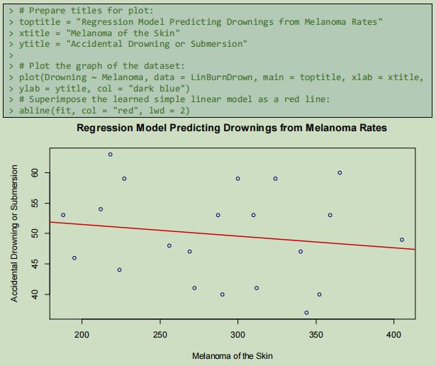
In the displayed model, the prediction would be that as melanoma death rates increase, accidental drownings will be less frequent. In this case, there was not an obvious linear relationiship between the two colums of variable data, however the learned model observes a minimum possible SSE and demonstrates that, in the supplied data at least, years where deaths caused by melanoma have been relatively high, deaths with drowning as the cause have been relatively lower. The population spending more time tanning in the Queensland sun rather than swimming in the water is a speculative conclusion.
4.2.2 Simple Linear Regression 1: Drownings Predicted by Melanoma rates
> # Load the dataset and assign to a variable:
> LinRegress1 <- read.csv("LinDrownBurn.csv")
> Melanoma <- LinBurnDrown[1:21,1]
> Drowning <- LinBurnDrown[1:21,2]
Using the R function lm() for linear modelling requires a parameter for Y as a function of X
which takes the form Y ~ X. The first stage of regression is fitting the model (Pathak 2014).
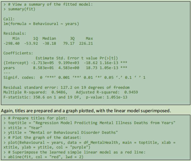
4.2.3 Simple Linear Regression 2: Years Predicting Mental and Behavioural Disorder Fatality Rate
For the second linear regression, previously loaded data is used.
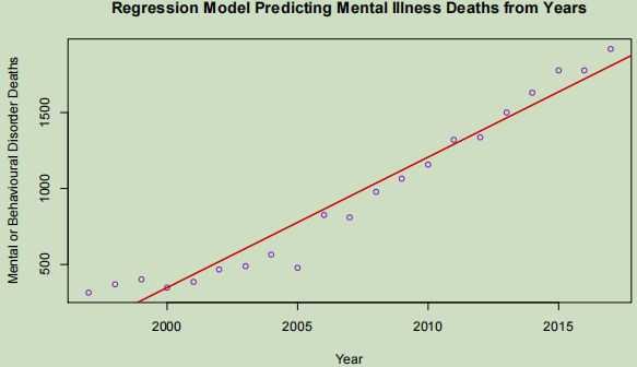
The linear model is a very close fit to the observed data and could be used to predict rates of deaths from the nominated cause with a high degree of accuracy. Six of the most recent seven observations appearing above the line shows that recently the rates have skewed away from the model by occurring at an increasing rate, likely forcing the model to predict above the observations of the previous decade. The positive correlation between these two variables gives a high degree of slope to the model.
5. Conclusion
This analysis of the governmental source data has revealed trends and patterns through various methods of data science, including intuitive observation of trends in raw data during initial data cleaning using Excel, plotted bar graphs of data showing increases and decreases during the years of observations and clustering of data points through K-means analysis.
Comparative observation of ranges of values has also been undertaken through the application of side-by-side boxplots. Predictive models have been calculated and shown by using simple linear regression algorithms, identifying both possible and definite linear correlation of factors.
To conclude, within the processes engaged in during this analysis task the progression of data to useable information and then to a limited knowledge of the reality that has informed the collected data has been shown. It is my hope that despite the morbid nature of statistics drawn from data such as observed within this report that the reader has learned something of the state of the health of Queensland citizens in the early 21st century and the potentially revealing nature of data modelling.
6. Reflections
During the course of this assigned analysis, I found myself often being initially unsure of how to proceed within a section to get the result that I desired and which variables were available to achieve a quality outcome, so I changed from the default R software to using RStudio. With improved access to image export and R documentation, my speed of processing was increased.
The layout and presentation quality of this document was initially not of a standard I was wanting, and so I engaged in a few tutorial classes on Lynda.com, and now I have several new skills regarding the construction and presentation of a long document with Word, which can only benefit me into the future.
As I completed section 5, I browsed some of the comments regarding the assignment on the student discussion board, and realised that I had perhaps done too much for this assignment, and could learn to check the board more often. Because part of the supplied example report was labelled as over complicated, I am hopeful that I will not be penalised for my attempt to match or exceed what I believed to be an expected standard. I was not reading the discussion board very much during the progress of my work as I did not find any enduring difficulties with the process. I am not usually one to set my effort by any group average, and although I have truly been as succinct as possible in demonstrating myunderstanding of the subject matter, I feel that I have made too large an effort in this case, without regret however as I have enjoyed the process immensely and believe that the specified audience has been catered for. I tried the removal of words outside RCode boxes, but the documents flow was inferior.
Since I have raised a couple of points within the document that I do not believe are yet closed, I respond to them here.
In section 3.1, I alluded to expectation of death, and would like to frame that here by suggesting that such knowledge could indeed be helpful to persons involved in planning for response to such a quickly increasing social issue.
This further variance in the most recent figure of 1921 compared to the mean of 951 suggests that the present frequency of deaths from this cause is astonishingly high.
With or without census data to adjust these figures to a percentile of Queenslands population, this is concerning. This data is also not broken down by age, gender, employment status/role nor ethnicity, where further insights could be gained.
In section 3.1.2, the plotting of a second graph for the disease2 vector slightly defies the parameters set for this analysis report, but it is included to demonstrate that when two sets of data are presented in the same form it is the differences that become apparent, and this helps with thoughtful comparison in the effort to get information from the data. Revealed here is knowledge not obviated by the isolated numbers.
Any suggestions of causation here could only be speculation, and as before, the graphs do not account for any rise in population leading to a linear increase in frequency. A per capita measure may be more revealing.
A trivariate analysis with breast cancer added to the set of section 3.2.2s data reveals that male genital cancer related deaths exceed the more publicised figures that I was aware of, and creating this analysis report has given me the knowledge of this factor within my own society, and the reasons for me not being consciously aware of the fact are well known Australian male attitudes toward self health. I intend to refine this knowledge into the wisdom to do something about it.
Are you struggling to keep up with the demands of your academic journey? Don't worry, we've got your back! Exam Question Bank is your trusted partner in achieving academic excellence for all kind of technical and non-technical subjects.
Our comprehensive range of academic services is designed to cater to students at every level. Whether you're a high school student, a college undergraduate, or pursuing advanced studies, we have the expertise and resources to support you.
To connect with expert and ask your query click here Exam Question Bank