32146 Data Visualization and Visual Analytics Assignment
- Subject Code :
32146
- Country :
Australia
General Requirements:
Students must use the Australian Open Tennis dataset, which can be found and downloaded from Canvas. After downloading the dataset, make sure to rename the dataset as Student-ID-Ass2.xlsx. The Australian Open Tennis dataset styles are as follows.
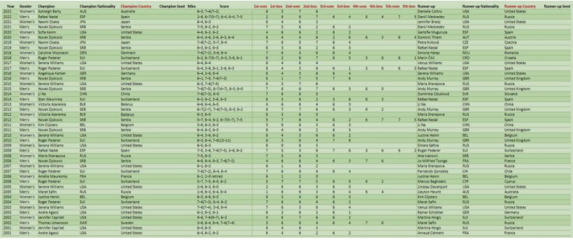
There are three blank columns for Champion Seed, Mins, and Runner-up Seed. Those three values hadnt been appropriately recorded before 1945, so we removed them from the dataset. Two columns have been created and filled for champion and runner-up countries because Tableau doesnt recognise the nationality code. In the scoreboard field, data is the text format that couldnt compare. We have converted it into 10x new columns representing each set of wins and losses.
Students should create several new data sheets inside the Student-ID-Ass2.xlsx file to import them into Tableau apps for visual analysis. Several visualisation graphs need to be created, including Treemap, Parallel coordinates, Geo-map, etc. Students must complete the champions win rate for champion and runner-up performance analysis and visualisation.
Storytelling is the key when attempting sports datavisualisation in this assignment. The visualisation should explore the whole dataset at a sufficiently specific level to enable the reader to understand the attributes and trends of the particular champions performance against the different players.
Students must cite all data sources and references used. The weighting of this assignment is 30% of a students overall final grade.
Detailed Requirements:
- Exclusive summarises the Australian Open Tennis dataset and indicates datas format, value and characteristics. Explains the visualisation techniques used in this assignment. The dataset with Tableau files has to submit with an assignment report. (5 marks)
- Select the different visualisation techniques to analyse players nationalities, genders, and performances in time series and group by nation. Illustrate the data graphically in time series, genders, or country by using designed
- layout techniques;
- rescaling axes techniques;
- labelling techniques;
- trends techniques;
- highlight and commands inserting storytelling techniques,
- interactive data visualisation.
Those visualisations should base on the concept of tennis players performance, including
- Treemap
Analyse the players pattern between the nationality, gender, score, wins, etc. - Parallel coordinate
Analyse the relationship between time, champions nationality, gender, score, wins, etc. - Geographic Map
Analyse the champion's location pattern between nationality, gender, score, wins, etc. - Win rate performance chart
Analyse performance patterns of top players (players who won 5 or more championships, both men and women), including nationality, gender, score, win rate, etc.
- Write a report explaining how you dealt with high-dimensional data in your data visualisation, particularly in combining multi-dimensional data. Describe the graphic attribute designs and labelling techniques used in your data visualisation and how they enhanced the readability and storytelling of the visualisation.Highlight any trends and breakthrough analysis you have discovered through the data visualisation process, particularly the top players performance patterns in the visual comparison chart. Conclude and summarise the advantages of Tableau or other visualisation apps you have used. (10 marks)