Prepare A Data Analysis Report On Queensland Deaths From Circulatory And Respiratory System Diseases And Cancers
- Country :
Australia
1. Introduction
1.1 Purpose and Use
The report explores and analyses the causes of deaths in Queensland and visualizes the data in an understandable and meaningful form. This is useful to researchers, business representatives, and government agencies.
1.2 Limitations
The report relies on the accuracy, range, and detail of the information provided by the Queensland Government, and collected by the Australian Bureau of Statistics. The dataset contains deliberately omitted information for privacy concerns, and the results for 2016 and 2017 are preliminary.
1.3 Scope
The report will only investigate human deaths from cancer and diseases from the circulatory and respiratory systems in Queensland between 1997 and 2017. The report will use one-variable, two-variable, k-means clustering, and linear regression analyses, with explanations on k-means clustering and linear regression.
1.4 Methodology
The report will use one and two-variable analysis, clustering with K-means, and linear regression data analyses and a range of data visualization techniques, and will be performed in R. The report will use academic texts and peer-reviewed journal articles from the field of data science.
2. Data Setup
2.1 Cleaning in Microsoft Excel
The dataset is stored as a comma separated value. Prior to being analysed in R, the file was duplicated as deaths.csv and cleaned in Excel. Several rows were deleted so that the 4th row containing the headings was on top. Then the cells were given the general number format, removing the commas in the figures over 999. This allows R to read them as integers instead of strings. Saving the csv file with Excel also removes blank columns that were present in the original csv file as a series of additional commas (See Appendix A for comparison). This will make the table that R creates significantly easier to setup and use.
2.2 Cleaning in Notepad
The dataset was then opened in notepad, where the data was further cleaned to remove and (c) values. The text was replaced with 0 in line with the file information below the data. The (c) text was replaced with 1 since it is a non-zero small value according to the file, and figures 3 and 4 were not redacted, meaning the text must represent either 1 or 2 (See Appendix A for comparison).
2.3 Setting up the data in R
Prior to analyzing the data, the data needed to be properly set-up in a data frame with the following code.
3. Exploratory Data Analyses
3.1 One-variable analyses
3.1.1 Bar graph for Cancer Death Types in 2010
This report will look at the data for cancer deaths in 2015, as it is the latest non-preliminary data available. A pie graph is effective for showing general relation in magnitude between elements of a dataset and the entire dataset itself. However, it is ineffective at representing exact figures and confusing for datasets with more than 2 elements (Klein and ProPublica 2018), so a column graph will be used instead to compare each specified cancer type.
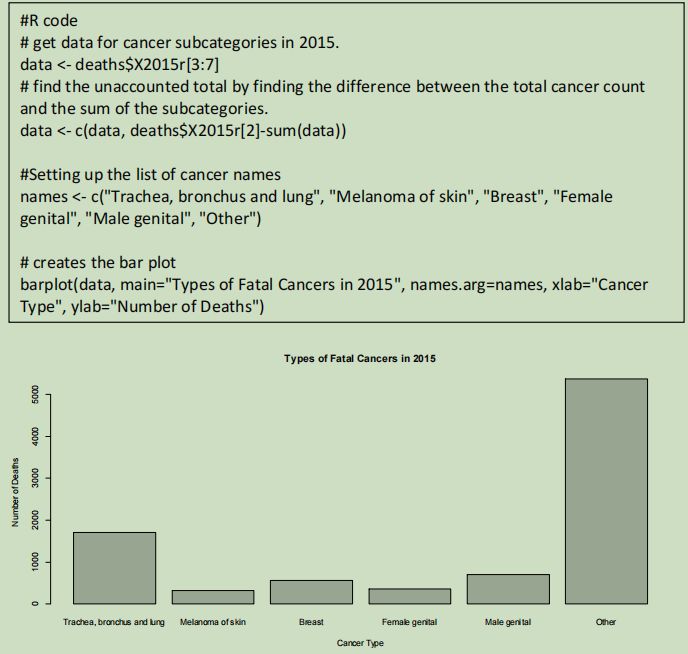
The column graph provides a visual representation of the actual mortality figures allowing researchers to better comprehend the scale of the disease. The graph demonstrates that the cancers from the respiratory system has an annual death count above one thousand, while the other specified categories fall below. The other cancers sum to over five thousand deaths.
3.1.2 Pie graph for Cancer Death Types in 2010
After creating the bar graph, the other category was noted to be significantly higher than all the specified types, so a pie graph was created to compare the total specified and total unspecified counts.
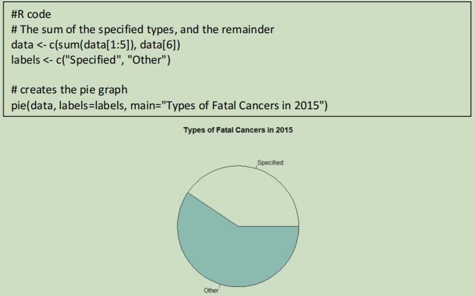
The pie graph helps visualize the relative scale of the deaths by unspecified cancers to the specified cancers. This demonstrates that over half the reported cancer deaths was caused by a type of cancer unlisted in this data set and highlights the need for further research and data collection.
3.2 Two-variable analyses
3.2.1 Scatter plot of circulatory and respiratory diseases
The scatter plot of circulatory and respiratory diseases helps to determine if there is a relationship between the two types of diseases. If there is a correlation, this could potentially assist doctors in diagnosing their patients.
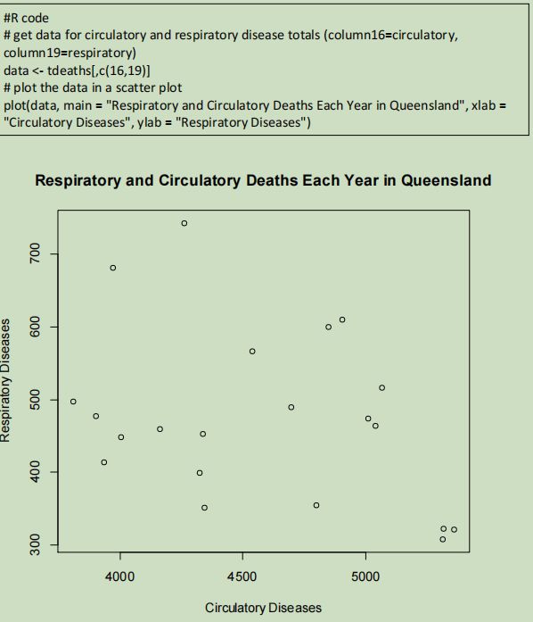
This scatter plot demonstrates that there is no clear correlation between respiratory diseases and circulatory diseases. It also demonstrates that deaths from circulatory diseases are much more common than from respiratory diseases by the figures on the axes.
3.2.2 Bar plot for Circulatory and Respiratory Diseases over 20 Years
Even though there is no correlation between circulatory and respiratory diseases, the scatter plot does not show how the deaths change over time. A bar graph that displays the death count over time can be used to demonstrate if there are any trends in the number of fatalities from these diseases.
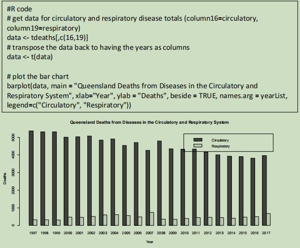
The bar graph demonstrates that the number of deaths from circulatory diseases is steadily decreasing over time, while the number of deaths from respiratory diseases remains relatively steady. The two categories appear to fit a linear model. It also further demonstrates the difference in number and scale between diseases from the two biological systems, where circulatory diseases are far more prevalent than respiratory diseases.
4. Advanced Analyses
4.1 K-means Clustering
4.1.1 Explanation
Clustering is the process of separating objects into groups based on similarity of various variables in the dataset (Provost 2013). K-means clustering is an iterative method of reducing the distance between all the data within a single group, for all groups (Trevino and Oracle 2018). It does this by assigning cluster positions and assigning each datapoint to its nearest cluster (Trevino and Oracle 2018). It then moves the clusters centroid to the average position of its assigned data (Trevino and Oracle 2018). This is repeated until a given criteria is reached, such as the centroids not moving between consecutive iterations (Trevino and Oracle 2018).
Although K-means clustering is guaranteed to give a local optimum, it is not guaranteed to find the global optimum on its first run (Trevino and Oracle 2018). To overcome this issue, multiple clustering runs with different starting centroids can be done, with the best fitting one being chosen (Trevino and Oracle 2018).
4.1.2 Clustering Cancer Deaths
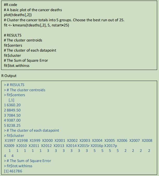
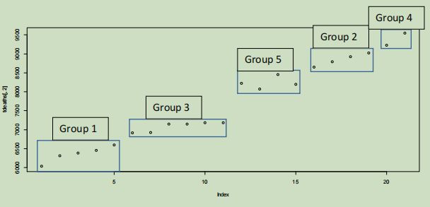
The k-means clustering will be done on the total cancer deaths between 1997 and 2017. Since the data set will be one dimensional (the count), the centroids will also be one dimensional, and thus will be the equivalent of lines on the plot below. This also means that the variables will not need to be weighted. The k-means clustering created 5 groups; two groups of containing 5 points each for the first 10 years, and three groups containing four, four, and two points respectively for the last 10 years. The sum of square errors for the best fitting cluster was 461786.
4.2 Linear Regression
4.2.1 Linear Regression Explanation
Data scientists frequently create models to find the approximate relationship between multiple variables to discover trends and make predictions (Stanton 2013). Linear regression is a linear model of the relationship between a dependent and independent variable and is expressed using two constants: a magnitude and intercept (Encyclopdia Britannica 2019.
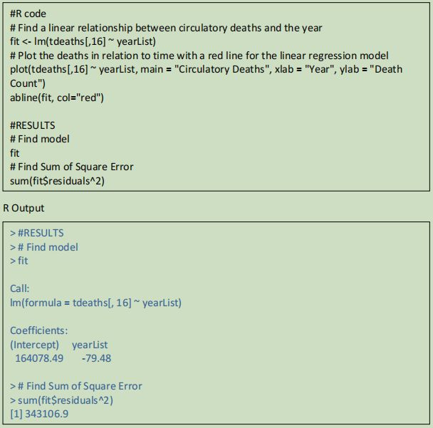
The linear regression model found the relationship:
Circulatory Deaths = 164078.49 ? 79.48 Year
With and SSE of 343106.9
This shows a downwards trend in the number of deaths, meaning the rate of deaths from circulatory diseases is decreasing over time Based on the plot, the data appears to fit the linear regression model well, although the deaths for 2007 and 2008 diverge the greatest from the line.
However, these points would not classify as outliers.
The linear regression model found the relationship:
Respiratory Deaths = ?9816.532 + 5.127 Year
With an SSE of 225043.3
This shows an upwards trend in the number of deaths, meaning the rate of deaths from respiratory diseases is increasing over time.
Based on the plot, the data seems to fit a polynomial model rather than a line, with crests at 2004 and 2012, and troughs at 2001, 2009, and 2014. The data also contains an outlier in 2007 where the death count is much higher than the surrounding data and doesnt follow the general trend.
These models show that while circulatory deaths are overall decreasing at about 80 deaths per year, respiratory deaths are overall increasing at about 5 deaths per year. Despite the circulatory death plot appearing to more closely follow the linear model, it has a higher SSE figure due to the higher figures, rather than the variance. By using both models, a prediction for when circulatory and respiratory deaths are equal.
Respiratory Deaths = Circulatory Deaths
?9816.532 + 5.127=164078.9-79.48x
84.607x=173895.022
X=173895.022/84.607 = 2055.326651
Therefore, the predicted year in which the number of respiratory deaths is above circulatory deaths is 2056.
Respiratory Deaths = ?9816.532 + 5.127 Year
= ?9816.532 + 5.127 2055.32651
= 721.12701677
Therefore, when the circulatory and respiratory deaths are predicted to be equal, they are also predicted to have 721 deaths each.
5. Conclusion
This data analysis has found several trends in the number of deaths from cancer and diseases from the circulatory and respiratory systems. The single variable analyses found most of the cancer deaths in 2015 were not included in the data file. The scatter-plot demonstrated that there was no simple relationship between circulatory and respiratory disease deaths, and the double bar graph helped visualise the difference in scale between the death frequencies and the linear trends of the categories over time.
The clustering analysis divided the number of cancer deaths into 5 groups, with 2 groups for the lower half, and 3 groups in the higher half. The linear regression models for the circulatory and respiratory deaths over time confirmed the observations from the double bar graph plot that the circulatory deaths were decreasing, while the respiratory deaths were slowly increasing. By combining the two linear models, the respiratory deaths were predicted to overtake circulatory deaths in 2055-56 with 721 deaths.
6. Reflections
I encountered a lot of difficulty trying to plot the variable analysis in R without using Excel to pre-process the data. I encountered no issues with plotting the first one variable analysis, but the second one variable analysis required me to learn to transpose the table to access the csv rows as columns. I had trouble with the two variable analyses until I learned that you can specify rows and columns using a list of indexes. I had no troubles with k-means clustering and linear regression, although that could be because I attempted it last, and thus had learned the new techniques I needed from the previous analyses.
I tried to use a wide variety of graphs and plots to best show off my ability to use R. That is one reason why the first single variable analysis had both a bar graph and a bar chart. The other reason was that although the bar graph clearly compared the unspecified cancer deaths to the other categories, it was unclear how it compared to the total of cancer deaths.
I was unable to plot the cancer deaths with the clusters being displayed from R in the k-means clustering analysis, so I created a regular plot and used Microsoft Word to draw the clusters on the plot myself.
I found cleaning the data in Excel and Notepad to be very useful and easy in making the data easy to use. However, by the time I learned about pre-processing in excel, in addition to data cleaning, I had nearly finished the analyses, so I continued without pre-processing.
The next time I encounter a similar situation, I will be better prepared to know which tool to use and more flexible and approachable to try easier alternatives. I learned a significant amount about how data frames work and how to use them to plot data. I also learned how useful non-R tools can be to cleanse and pre-process the data for R to plot, and that the correct tool should be used in data science for its appropriate task, or it will become significantly and needlessly harder.
Are you struggling to keep up with the demands of your academic journey? Don't worry, we've got your back! Exam Question Bank is your trusted partner in achieving academic excellence for all kind of technical and non-technical subjects.
Our comprehensive range of academic services is designed to cater to students at every level. Whether you're a high school student, a college undergraduate, or pursuing advanced studies, we have the expertise and resources to support you.
To connect with expert and ask your query click here Exam Question Bank