Data Exploration And Data Charts Assignment
- Country :
Australia
Exploratory Data Analysis
- Critical process of performing initial investigations on data
- An approach to analyzing datasets to summarize their main characteristics, often with visual methods.
- Uses summary statistics and graphical representations to
- discover patterns
- spot anomalies
- test hypothesis
- check assumptions
Exploratory Data Analysis
- EDA typically relies heavily on visualizing the data to assess patterns and identify data characteristics that the analyst would not otherwise know to look for.
- It also takes advantage of a number of quantitative methods to describe the data.
- https://www.svds.com/value-exploratory-data-analysis/
Types of Exploration
- Univariate Analysis
- Bivariate Analysis
- Multivariate Analysis
https://chartio.com/learn/data-analytics/what-is-exploratory-data-analysis/
Univariate Analysis
Provides a summary statistics for each field in the raw dataset.
Performed on one column of data in a dataset.
Descriptor like median, median, mode, range, variance etc that we discussed earlier are ways of performing simple univariate analysis on data.
There are visualization charts that can be used to perform Univariate analysis e.g., Box and Whisker plot.
Univariate Analysis
Examples of visualization charts for univariate analysis
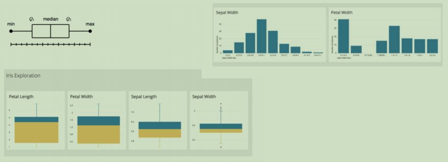
Univariate descriptors of data
Frequencies and Percentages
- Frequencies report actual count or numbers ; used when sample size are smaller
- Percentages generalize to a population; Make sure add up to a 100%
Univariate descriptors of data
Averages
- Used to summarize a range of numbers using one number
- Mean, Median and Mode
- Mean arithmetic average; sum of values divided by number of cases; used in interval or ratio data; affected by outliers.
- Median Middle value in an ordered data; not affected by outliers.
Univariate descriptors of data
Averages
- Mode the most common value
- Mean and median are not suitable for nominal variables e.g, most common zip code. In such cases, mode gives a descriptor of the data.
Bivariate Analysis
Analyses two data columns at a given time; two variables are observed against each other.
This could be to provides comparisons between two variables in the dataset.
The comparison could be to identify similarities of differences.
Bivariate descriptors of data
Comparison between two data columns
- Correlation will quantify similarities Pearson (continuous data) or Sphearmans Rho (non-continuous data).
- T-test will show difference between groups.
These measures are used on continuous numeric data and not suitable for categorical or ordinal data.
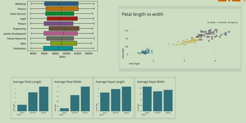
Multivariate Analysis
- A generalization of bivariate analysis.
- Multivariate data analysis refers to any statistical technique used to analyse data that arises from more than one variable.
- This models more realistic applications, where each situation, product, or decision involves more than a single variable.
- Easier to appreciate using visualization approaches.

Multivariate Analysis
An example Dual axis chart
- Allows you to plot data using two y-axes and a shared x-axis.
- It has three data sets.
- One is a continuous set of data and the other is better suited to grouping by category.
- Can be used to visualize a correlation or the lack thereof between these three data sets.
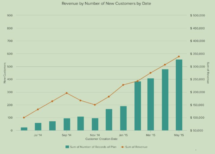
Multivariate Analysis
An example Dual axis chart
- For example, the chart shows how many new customers this company brings in each month.
- It also shows how much revenue those customers are bringing the company.
- This makes it simple to see the connection between the number of customers and increased revenue.

How to Choose the Right Chart or Graph for Your Data
- Identify your goals for presenting the data.
- Figure out what data you need to achieve your goal.
- Gather your data.
- Select the right type of graph or chart.
Selecting the right chart type
1. Do you want to compare values?
Charts and graphs are perfect for comparing one or many value sets, and they can easily show the low and high values in the data sets.
To create a comparison chart, use these types of graphs:
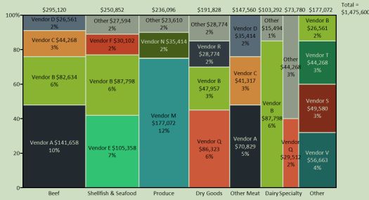
- Column
- Mekko (image shown)
- Bar
- Pie
- Scatter Plot
- Line charts
2. Do you want to show the composition of something?
Use this type of chart to show how individual parts make up the whole of something.
E.g., device type used for mobile visitors to your website or total sales broken down by sales rep.
To show composition, use these charts:
- Pie
- Stacked Bar
- Mekko
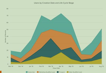
- Area chart (see image)
- Waterfall
3. Do you want to understand the distribution of your data?
Distribution charts help you to understand outliers, the normal tendency, and the range of information in your values.
Use these charts to show distribution:
- Scatter Plot
- Mekko
- Line
- Column
- Bar
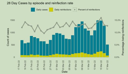
4. Are you interested in analyzing trends in your data set?
If you want to know more information about how a data set performed during a specific time period, there are specific chart types that do extremely well.
- Line
- Dual-Axis Line
- Column
5. Do you want to better understand the relationship between value sets?
Relationship charts can show how one variable relates to one or many different variables.
You could use this to show how something positively affects, has no effect, or negatively affects another variable.
When trying to establish the relationship between things, use these charts:
- Scatter Plot
- Bubble
- Line
Descriptive Statistics
- Sum
- Count
- Mean
- Median
- Mode
- Range
- Standard deviation
- Variance
Are you struggling to keep up with the demands of your academic journey? Don't worry, we've got your back! Exam Question Bank is your trusted partner in achieving academic excellence for all kind of technical and non-technical subjects.
Our comprehensive range of academic services is designed to cater to students at every level. Whether you're a high school student, a college undergraduate, or pursuing advanced studies, we have the expertise and resources to support you.
To connect with expert and ask your query click here Exam Question Bank