Advanced Data Visualization with R DAT4025
- Subject Code :
DAT4025
Introduction
Importance and Significance of Data Visualization in Advanced Data Analysis:
In this connection, it would be imperative to understand how data visualization further the processing of raw data in order to yield important insights. It provides users with the ability to easily find relationships, such as trends, propensity or tendencies, which otherwise would not be easily seen from the data. In the current generation where large data is gathered, visualization makes the evaluation process faster and more efficient to common users and computer literate ones (Islam & Jin, 2019).. According to Edward Tufte, probably the father of data visualization, graphical excellence represents that which communicates the greatest amount of information in the shortest time with the smallest amount of ink.
This process of visualizing data makes it easier to make important decisions because it reduces play of guessing as some figures may be complex to infer (Cho et al., 2014). Today many industries ranging from banking, health, marketing and production, need to capture the essence and visual insight of trends in order to make informed decisions (Embarak & Embarak, 2018).
Role of Data Visualization in Gaining Insights, Identifying Patterns, and Making Informed Decisions:
Data visualization makes it easy for users to understand the trends in a given data, or outliers and the correlation of variables. It act as a tool that transforms raw data into formatted insights, helping organizations to take appropriate timely actions. With the help of solutions like scatter plot and line chart, the trends are made clearer and the concept of predictive analysis, which contributes to the part of long-term business planning, is possible.
Theoretical Foundations
Perception, Cognition, and Visual Encoding:
Oddly enough, efficacy of data visualization is based on the categories of perception and cognition. By enhancing color and size of an object, the data dimensions could be easily understood, thus visual encoding plays an important role (Vetter & Newen, 2014). According to Tufte, For this reason, most graphics and presentations should be simple and clear. The reinforcement of interactivity and other machine learning-based advanced visualization tools have further boosted users interaction.
Data Visualization Techniques in R
Advanced Data Visualization Techniques in R:
R is a versatile or useful tool for generating a broad spectrum of the sophisticated visualizations of data. Here are a few notable techniques:
- Interactive Visualizations: Shiny, Plotly and ggvis are the R packages that can be used to build the analytical charts and plots that are capable of changed interactivity in response to user inputs. These tools allow the users to interact with the data in a more natural way as opposed to just observing static charts (Po et al., 2022).
- Geospatial Visualizations: Geospatial Visualizations: Rs ggplot2, leaflet, and sf packages are used for geospatial visualization which assist in mapping of data in different geographical regions.
- Network Visualizations: While dealing with the networks, R is almost unparalleled, especially with the help of igraph and ggraph. These techniques are used to help detect connections between objects; commonly applied to social networks, web links or biological paths.
- Time Series Visualizations: Basic to the analysis of time varying data is the use of time series plots. Rs forecast and xts packages alongside ggplot2 give the needed features in enabling a user to present data that contains trends, seasonality, and anomalies in a visually appealing way.
Strengths and Limitations:
All the techniques of visualizations are not perfect and they each have their advantages and disadvantages. With the capability to be more engaging, interactive visualizations demand more computations. Spatial overlays are particularly relevant for spatial data and may be overwhelming where designs are not well done.
Design Principles and Best Practices
Key Design Principles:
Effective data visualizations follow key design principles to communicate information clearly:
- Color: It is expected that colours must be used with significance. RColorBrewer has palates which are nice looking and easy to understand so as not to complicate the view of the map.
- Layout and Typography: A neat and clutter-free design makes sure that the viewers do not get distracted from the message of the campaign. Position of axis names, presentation of the title, and the font level enhance the general outlook of the presented visualization.
- Interactivity: Other enhancements like zooming into elements, mouse-over information, or elements the user can click on enables the users to drill down further into the data (Midway, 2020).
Real-World Examples:
Regarding the application of data visualizations, one fine example of work done in real-world settings can be John Burn-Murdochs COVID-19 data visualizations created for the Financial Times. These mapping employed basic yet powerful line graphs to monitor infection rates in the world.
Exploratory Phase of Data Preparation for Data Visualization
Before organizations embark on the actual process of making data visualizations, it is essential to make preparations on the data that will be processed (Qin et al., 2020). R contains various features enhanced in creating datasets for visualization in a proper and comprehensive method.
- Handling Missing Data: There is the presence of lacunae which distorts the visual tools generated to draw given conclusions. Like the na, functions that are available in R include in R include. In case of guiding missing values, omit() or impute() methods are utilized in order to prevent distorting of the visualization.
- Managing Outliers: This is because outliers are characterised by significantly higher or lower values as compared to other data points in the population which can skew the visual representation of data. Advanced and efficient methodologies namely z-score filtering and more of it, box plots where geom_boxplot() in ggplot2 comes in and finally log transformation assist to identify the outliers.
Data Transformations: Data transformation like scaling, normalizing or aggregation of the data may be required in preparation for visualization results. For example, if the data happens to be distributed logarithmically, then logarithmic transformation function (log or log10) is used or in case of square root distribution, square root transformation function (sqrt) is used to improve the interpretability of the figures. Other methods which help in increasing the plot interpretability include stacking, which involves an input data arranging method, including grouping by time or category. All in all, it can be stated that preparing and, in particular, wrangling data in R are critical to fitting the data for visualization.
Interactive Visualisations and Dashboards
Interactive visualizations and dashboards have become essential tools in modern data analysis, offering a dynamic way to explore, analyze, and communicate insights. In R, tools like Shiny and Plotly enable the creation of powerful interactive visualizations, where users can manipulate data in real-time, change visual parameters, and explore different aspects of a dataset without needing to regenerate static charts (Sievert, 2020).
Shiny
Shiny is a web application framework for R that turns analyses into interactive web apps. It allows for real-time interactivity, enabling users to control visual elements such as sliders, checkboxes, and input fields to manipulate data (Beeley, 2016).
Plotly
Plotly is another powerful library that allows for the creation of interactive plots directly within R. Its integration with ggplot2 makes it easy to turn static visualizations into dynamic, interactive ones (Giles & Burn-Murdoch, 2020).
Benefits and Challenges
The primary benefit of interactive visualizations is the enhanced user experience. They enable better data exploration, allowing users to filter, zoom, and explore different dimensions of the data. This real-time interactivity helps in discovering patterns and insights that may not be evident in static charts. Additionally, dashboards enable decision-makers to monitor key metrics dynamically.
Case Study Examples
Case Study 1: Geospatial Analysis of Air Quality Data
Dataset Overview:
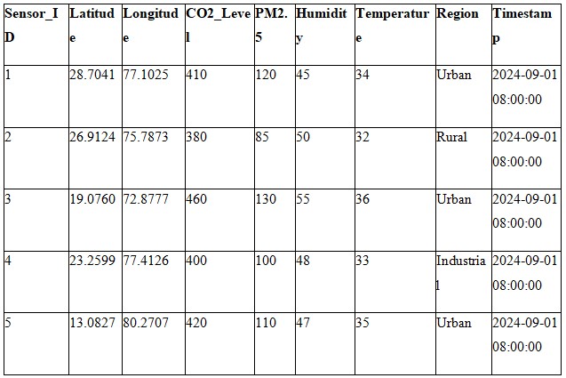
The first case study is specifically on environmental monitoring; with data that is hypothetical of the air quality sensors set in certain areas (urban, rural,industrial). The dataset records CO2 concentration, Particulate Matter (PM2. 5), Humidity and Temperature at certain time instants and geographical coordinates of latitude and longitude.
Hypothetical Dataset (Geospatial Environmental Data):
Visualisation Techniques Used:
For the interactive map, the authors used a package called leaflet while for the static map, the authors used ggplot2 to display density, mode and outlier of air quality differently in various regions. A dynamic map was developed in of the location of the sensors using the Leaflet package and static geographical graphs in ggplot to illustrate CO2 levels.
Insights:
- This means that there is lower air quality as demonstrated by the CO2 and PM2. 5 that are higher in the urban regions.
- Industrial areas are also characterized by high pollution and therefore it becomes an important area of focus.
- The visualization will enable stakeholders to display areas that may require air quality management to be done.
Case Study 2: Time Series Analysis of Web Traffic Data
Dataset Overview:
This case is to perform an analysis of the web traffic for a considered hypothetical e-commerce Website for 30 days. The dataset records traffic patterns by the hours, these include the number of visits, bounce rates as well as the mean session length. The objective is to track the performance of the sites, the traffic and the interaction, and intensiveness of the users.
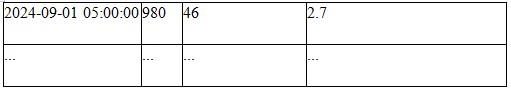
Hypothetical Dataset (Web Traffic Data):
Visualisation Techniques Used:
In the process of creating this report, a static time series was made using ggplot2 while plotly was used in the creation of the interactive time series. These charts assist in interpreting trends relating to the users activity level, their bounce rates, and the time they spent within the website over the one month period.
Time Series Chart:
- The visits, bounce rate, and the session duration were analyzed using the ggplot2 in order to create the static chart below.
- This is where Plotly was used to introduce interactivity; zooming and selecting specific areas on the time axis, which can then give an insight on traffic intensity and user engagement.
Insights:
- Visits: Daily distributions reveal specific traffic shape, which reaches its maximum in the middle of a day, and has minima in the early morning. For instance, the traffic becomes very busy around the afternoon, this is assuming that people become active in the course of their working day.
- Bounce Rate: The bounce rate is high early morning as many users most probably enter the site during other off peak times only to leave immediately. When traffic is high, the bounce rate is low which implies that there is better engagement during such periods.
- Average Session Duration: As is the case with visits, intTime is also higher in peak traffic hours, which means that individuals are spending more time on the site when they are active.
Conclusion
The concept of data visualization is widely used in modern data analysis as an effective instrument to work with the information and to define the valuable insights from the various materials. As mentioned throughout this study, the focus has been put on various methods and functionalities of the R software with the emphasis on the possibility to turn messy raw data into comprehensible visualization.
Key Findings:
1.Geospatial and Network Visualizations: Visualization of such data as spatial and relational necessarily uses geospatial mapping with ggplot and leaflet and network analysis with igraph. These methods serve to make useful impressions of geographical configurations and correlations between objects and entities which are pivotal in environmental scanning and social network mapping among others.
2.Time Series Analysis: The qualitative data analysis through using ggplot2 and Plotly will explain trends and cycles present with the variety of time series that show the decision making of fluctuations and organized seasons. This will come in handy while tracking the website traffic and performance indicators which help the businesses in decision making.
Challenges and Opportunities:
- Challenges: Such features as interactivity and complexity within a chosen visual representation call for substantial computational capacity and can turn out to be overwhelming at times if properly managed. One of the major issues that has to be faced is the ability to manage, manipulate large sets of data and check the correctness of created visualization.
- Opportunities: There are fantastic opportunities with the improving options for data visualization, both as tools and analysis methods. Interactivity, better visuals and the capacity for multiple types of data create the means for better and more functional analytics.
Are you struggling to keep up with the demands of your academic journey? Don't worry, we've got your back!
Exam Question Bank is your trusted partner in achieving academic excellence for all kind of technical and non-technical subjects. Our comprehensive range of academic services is designed to cater to students at every level. Whether you're a high school student, a college undergraduate, or pursuing advanced studies, we have the expertise and resources to support you.
To connect with expert and ask your query click here Exam Question Bank